ilxButtonPanel API
API Functions (Version 2.0)
Ribbon Panel API
Add the ilxButtonPanel Addin Reference
'Reference the ilxBtnPanel Addin
AddVbFile "ilxBtnPanel.vb"

'Set a reference to the Button Panel First
ilxBtnPanel = ilxBtnPanelVB.GetBtnPanel(ThisDoc.Document, ThisApplication)
Sets the variable 'ilxBtnPanel' to the reference of the addin. Always takes ThisDoc.Document and ThisApplication.
Global and Named Ribbon Panels
Controls can be grouped on the ribbon tab into seperate panels. There six global panels, and each document can have unlimited named panels. However be mindful of the users screen space when creating extra panels. Controls added to any of the global panel should fire external rules only and/or only modify predefined parameters. The rules should be able to run on any document type the panel is visible for.
The predefines names of the global panels are:
"GLOBAL" : This panel and controls added to this panel will accessible from any open document.
"GLOBALPART" : This panel and controls added to this panel will accessible from any all part document.
"GLOBALSHEETMETAL" : This panel and controls added to this panel will accessible only from all sheetmetal part documents.
"GLOBALDRAWING" : This panel and controls added to this panel will accessible only from all drawing documents.
"GLOBALASSEMBLY" : This panel and controls added to this panel will accessible only from an all assembly part documents.
"GLOBALWELDMENT" : This panel and controls added to this panel will accessible only from all weldment assembly documents.
AddRibbonPanel
'Creates a Ribbon Panel
ilxBtnPanel.AddRibbonPanel("PanelName", "Panel Label")
Creates a named panel on the ribbon for the document the rule was run in.
PanelName : The internal name of the panel to be used in rules to reference the panel.
Panel Label : The label text of the named panel.
AddRibbonButton
'Adds a document button that executes a rule.
ilxBtnPanel.AddRibbonButton("ButtonName", "Button Label", "RuleName", IsExternal)
'Adds a document button that executes a rule with arguments.
ilxBtnPanel.AddRibbonButton("ButtonName", "Button Label", "RuleName", IsExternal, _
    RuleArgs)
'Adds a document button with a custom image that executes a rule.
ilxBtnPanel.AddRibbonButton("ButtonName", "Button Label", "RuleName", IsExternal, _
    "IconFile", LargeIcon)
'Adds a document button with a custom image that executes a rule with arguments.
ilxBtnPanel.AddRibbonButton("ButtonName", "Button Label", "RuleName", IsExternal, _
    RuleArgs, "IconFile", LargeIcon)
'Adds a button to a named panel that executes a rule.
ilxBtnPanel.AddRibbonButton("ButtonName", "Button Label", "PanelName", "RuleName", _
    IsExternal)
'Adds a button to a named panel that executes a rule with arguments.
ilxBtnPanel.AddRibbonButton("ButtonName", "Button Label", "PanelName", "RuleName", _
    IsExternal, RuleArgs)
'Adds a button with a custom image to a named panel that executes a rule.
ilxBtnPanel.AddRibbonButton("ButtonName", "Button Label", "PanelName", "RuleName", _
    IsExternal, "IconFile", LargeIcon)
'Adds a button with a custom image to a named panel that executes a rule.
ilxBtnPanel.AddRibbonButton("ButtonName", "Button Label", "PanelName", "RuleName", _
    IsExternal, RuleArgs, "IconFile", LargeIcon)
Adds a button to the ribbon on a named or default panel that executes a rule.
ButtonName : The internal name of the button. Follows same naming rules as parameters.
Button Label : The displayed text that appears on the button.
PanelName : Specifies the panel the control is on.
RuleName : The name of the rule to be fired when the button is pressed.
IsExternal : True/False. Defaults to False. If True the rule to be fired is an external rule.
RuleArgs : An ArrayList of arguments to pass to the rule to be fired.
IconFile : The filename of the image to us as an icon. If not a full path name the iLogic rule directories will be searched.
LargeIcon : True/False. Defaults to True. If true the button will have a large icon and small icon if False.
AddRibbonParamButton
'Adds a button to the ribbon that sets a parameter value.
ilxBtnPanel.AddRibbonParamButton("ButtonName", "Button Label", "ParamName", ParamExp)
'Adds a button with a custom icon to the ribbon that sets a parameter value.
ilxBtnPanel.AddRibbonParamButton("ButtonName", "Button Label", "ParamName", ParamExp, _
    "IconFile", LargeIcon)
'Adds a button to a named panel in the ribbon that sets a parameter value.
ilxBtnPanel.AddRibbonParamButton("ButtonName", "Button Label", "PanelName", "ParamName", _
    ParamExp)
'Adds a button with a custom icon to a named panel in the ribbon that sets a parameter value.
ilxBtnPanel.AddRibbonParamButton("ButtonName", "Button Label", "PanelName", "ParamName", _
    ParamExp, "IconFile", LargeIcon)
Adds a button to the ribbon on a named or default panel that executes a rule.
ButtonName : The internal name of the button. Follows same naming rules as parameters.
Button Label : The displayed text that appears on the button.
PanelName : Specifies the panel the control is on.
ParamName : The name of the parameter to be set when the button is pressed.
ParamExp : Expression or value to set the parameter too. Can be Expression, Text, or True/False. Units must be compatible with that of the parameter.
IconFile : The filename of the image to us as an icon. If not a full path name the iLogic rule directories will be searched.
LargeIcon : True/False. Defaults to True. If true the button will have a large icon and small icon if False.
AddRibbonButtonPopup and AddRibbonSplitMRUButton
'Adds a button poup.
ilxBtnPanel.AddRibbonButtonPopup(LargeIcon, _
New ArrayList({ _
    ButtonDefinitions, ... _
    }) _
})
'Adds a button poup to a named panel.
ilxBtnPanel.AddRibbonButtonPopup("PanelName", LargeIcon, _
New ArrayList({ _
    ButtonDefinitions, ... _
    }) _
})
'Adds a split MRU button poup.
ilxBtnPanel.AddRibbonSplitMRUButtonPopup(LargeIcon, _
New ArrayList({ _
    ButtonDefinitions, ... _
    }) _
})
'Adds a split MRU button poup to a named panel.
ilxBtnPanel.AddRibbonSplitMRUButtonPopup("PanelName", LargeIcon, _
New ArrayList({ _
    ButtonDefinitions, ... _
    }) _
})
Adds a button pop or most recently used button popup to the ribbon on a named or default panel that executes a rule.
PanelName : Specifies the panel the control is on.
LargeIcon : True/False. Defaults to True. If true the button will have a large icon and small icon if False.
ButtonDefinitions : An ArrayList of button definitions. Requires at least one button definition. The button definitions can be rule or parameter definitions. (See below.)
Rule Button and Parameter Button Definitions
'Rule button definition the last value must be "RULE"
New ArrayList({"ButtonName", "Button Label", "RuleName", IsExternal, _
    RuleArgs, "IconFile", "RULE" })
'Parameter button definition the last value must be "PARAMETER"
New ArrayList({"ButtonName", "Button Label", "ParamName", ParamExp, _
    "IconFile", "PARAMETER" })
ButtonName : The internal name of the button. Follows same naming rules as parameters.
Button Label : The displayed text that appears on the button.
RuleName : The name of the rule to be fired when the button is pressed.
IsExternal : True/False. Defaults to False. If True the rule to be fired is an external rule.
RuleArgs : An ArrayList of arguments to pass to the rule to be fired. If there are no arguments this value must be Nothing.
ParamName : The name of the parameter to be set when the button is pressed.
ParamExp : Expression or value to set the parameter too. Can be Expression, Text, or True/False. Units must be compatible with that of the parameter.
IconFile : The filename of the image to us as an icon. If not a full path name the iLogic rule directories will be searched.
Example of complete AddRibbonButtonPopup
ilxBtnPanel.AddRibbonButtonPopup(True, _
    New ArrayList({ _
        New ArrayList({ "btn16GA", "16GA", "SetThickness", False, _
            New ArrayList({"16GA Stl"}), "imgStyle.png", "RULE"}), _
        New ArrayList({ "btn14GA", "14GA", "SetThickness", False, _
            New ArrayList({"14GA Stl"}), "imgStyle.png", "RULE"}), _
        New ArrayList({ "btn12GA", "12GA", "SetThickness", False, _
            New ArrayList({"14GA Stl"}), "imgStyle.png", "RULE"}) _
    }) _
)
The resulting button.
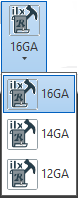
Note: If the addin is beyond the trial and not activated this control will be expanded to a row of buttons.
AddRibbonTogglePopup
'Adds a ToggleButtonPopup that sets the parameters to True/False
ilxBtnPanel.AddRibbonTogglePopup("ButtonName", "Button Label", _
    ParameterDefinitions _
)
'Adds a ToggleButtonPopup to a named panel that sets the parameters to True/False
ilxBtnPanel.AddRibbonTogglePopup("ButtonName", "Button Label", "PanelName", _
    ParameterDefinitions _
)
'Adds a ToggleButtonPopup with custom icon that sets the parameters to True/False
ilxBtnPanel.AddRibbonTogglePopup("ButtonName", "Button Label", "IconFile", LargeIcon, _
    ParameterDefinitions _
)
'Adds a ToggleButtonPopup with custom icon to a named panel that sets the parameters to True/False
ilxBtnPanel.AddRibbonTogglePopup("ButtonName", "Button Label", "PanelName", "IconFile", _
    LargeIcon, ParameterDefinitions _
)
ButtonName : The internal name of the button. Follows same naming rules as parameters.
Button Label : The displayed text that appears on the button.
PanelName : Specifies the panel the control is on.
ParamDefinitions : An ArrayList of parameter definitions.
IconFile : The filename of the image to us as an icon. If not a full path name the iLogic rule directories will be searched.
LargeIcon : True/False. Defaults to True. If true the button will have a large icon and small icon if False.
Parameter Definitions
'Parameter Definition for a Toggle Button
New ArrayList({"ButtonName", "Button Label", "ParamName")
ButtonName : The internal name of the button. Follows same naming rules as parameters.
Button Label : The displayed text that appears on the button.
ParamName : The name of the parameter to be set when the button is toggled. Must be a True/False parameter
Example of complete AddRibbonTogglePopup
ilxBtnPanel.AddRibbonTogglePopup("tglFeatures", "Design Features", _
    New ArrayList({ _
        New ArrayList({ "btnCSinks", "Include Counter Sinks", "IncludeCSinks"}), _
        New ArrayList({ "btnCutouts", "Include Cutouts", "IncludeCutouts"}), _
        New ArrayList({ "btnCnrRnds", "Round Corners", "IncludeFillets"}) _
    }) _
)
The resulting button.
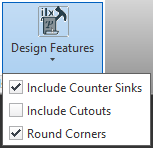
Note: If the addin is beyond the trial and not activated this control will be expanded to a row of push buttons.
AddRibbonRulePushButton
'Adds a push button to the ribbon that passes True/False to a rule.
ilxBtnPanel.AddRibbonRulePushButton("ButtonName", "Button Label", "RuleName", IsExternal)
'Adds a push button with a custom icon to the ribbon that passes True/False to a rule.
ilxBtnPanel.AddRibbonRulePushButton("ButtonName", "Button Label", "RuleName", IsExternal, _
    "IconFile", LargeIcon)
'Adds a push button to a named panel in the ribbon that passes True/False to a rule.
ilxBtnPanel.AddRibbonRulePushButton("ButtonName", "Button Label", "PanelName", "RuleName", _
    IsExternal)
'Adds a push button with a custom icon to a named panel in the ribbon that passes True/False to a rule.
ilxBtnPanel.AddRibbonRulePushButton("ButtonName", "Button Label", "PanelName", "RuleName", _
    IsExternal, "IconFile", LargeIcon)
Adds a push button to the ribbon on a named or default panel that executes a rule and passes a True/False value.
ButtonName : The internal name of the button. Follows same naming rules as parameters.
Button Label : The displayed text that appears on the button.
PanelName : Specifies the panel the control is on.
RuleName : The name of the rule to be fired when the button is pressed.
IsExternal : True/False. Defaults to False. If True the rule to be fired is an external rule.
IconFile : The filename of the image to us as an icon. If not a full path name the iLogic rule directories will be searched.
LargeIcon : True/False. Defaults to True. If true the button will have a large icon and small icon if False.
AddRibbonPushButton
'Adds a push button to the ribbon that sets a parameter to True/False.
ilxBtnPanel.AddRibbonPushButton("ButtonName", "Button Label", "ParamName")
'Adds a push button with a custom icon to the ribbon that sets a parameter to True/False.
ilxBtnPanel.AddRibbonPushButton("ButtonName", "Button Label", "ParamName", _
    "IconFile", LargeIcon)
'Adds a push button to a named panel in the ribbon that sets a parameter to True/False.
ilxBtnPanel.AddRibbonPushButton("ButtonName", "Button Label", "PanelName", "ParamName")
'Adds a push button with a custom icon to a named panel in the ribbon that sets a parameter to True/False.
ilxBtnPanel.AddRibbonPushButton("ButtonName", "Button Label", "PanelName", "ParamName", _
    "IconFile", LargeIcon)
Adds a push button to the ribbon on a named or default panel that executes a rule and passes a True/False value.
ButtonName : The internal name of the button. Follows same naming rules as parameters.
Button Label : The displayed text that appears on the button.
ParamName : The name of the parameter to be set when the button is toggled. Must be a True/False parameter
PanelName : Specifies the panel the control is on.
IconFile : The filename of the image to us as an icon. If not a full path name the iLogic rule directories will be searched.
LargeIcon : True/False. Defaults to True. If true the button will have a large icon and small icon if False.
AddRibbonParamComboBox
'Adds a ComboBox based on a multi value parameter.
ilxBtnPanel.AddRibbonParamComboBox("ComboName", "Combo Label", "ParamName")
'Adds a ComboBox with a list of values for a parameter.
ilxBtnPanel.AddRibbonParamComboBox("ComboName", "Combo Label", "ParamName", _
    New ArrayList({"exp1", "exp2", "exp3"}), ["DefaultValue"])
'Adds a ComboBox based on a multi value parameter to a named panel.
ilxBtnPanel.AddRibbonParamComboBox("ComboName", "Combo Label", "PanelName", "ParamName")
'Adds a ComboBox with a list of values for a parameter.
ilxBtnPanel.AddRibbonParamComboBox("ComboName", "Combo Label", "PanelName", "ParamName", _
    New ArrayList({"exp1", "exp2", "exp3"}), ["DefaultValue"])
Adds a ComboBox control to the ribbon. It can use the values specified in the parameter if it is a multi value parameter or a list of values can be used. The parameter will be set to the value selected.
ComboName : The internal name of the button. Follows same naming rules as parameters.
Combo Label : The displayed text that appears when the control is hovered over with the mouse.
PanelName : Specifies the panel the control is on.
ParamName : The name of the parameter to be set when the button is pressed. If there is no ArrayList of expressions parameter must be a multi value parameter.
DefaultValue : Expression from the ArrayList to set the ComboBox to when it is first added.
Note: If the addin is beyond the trial and not activated the combo box will be expanded to a ButtonPopup control.
AddRibbonRuleComboBox
'Adds a ComboBox with a list of values that passes the selected value to a rule as an argument.
ilxBtnPanel.AddRibbonRuleComboBox("ComboName", "ComboLabel",  _
    New ArrayList({"exp1", "exp2", "exp3"}), "DefaultValue", "RuleName", IsExternal)
'Adds a ComboBox on a named panel with a list of values that passes the selected value to a rule as an argument.
ilxBtnPanel.AddRibbonRuleComboBox("ComboName", "ComboLabel", "PanelName", _
    New ArrayList({"exp1", "exp2", "exp3"}), "DefaultValue", "RuleName", IsExternal)
Adds a ComboBox control to the ribbon.The list of values will be used to populate the control. The value selected will be passed to the rule as an argument.
ComboName : The internal name of the button. Follows same naming rules as parameters.
Combo Label : The displayed text that appears when the control is hovered over with the mouse.
PanelName : Specifies the panel the control is on.
RuleName : The name of the rule to be fired when the button is pressed.
IsExternal : True/False. Defaults to False. If True the rule to be fired is an external rule.
DefaultValue : Expression from the ArrayList to set the ComboBox to when it is first added.
Note: If the addin is beyond the trial and not activated the combo box will be expanded to a ButtonPopup control.
AddRibbonSeperator
'Adds a ribbon seperator to the document panel.
ilxBtnPanel.AddRibbonSeperator()
'Adds a ribbon seperator to a named panel.
ilxBtnPanel.AddRibbonSeperator("PanelName")
Adds a seperator to the ribbon.
PanelName : Specifies the panel the control is on.
Note: If the addin is beyond the trial and not activated the seperator will not be added.
RibbonControlEnabled
'Enables or disables a control on the document panel.
ilxBtnPanel.RibbonControlEnabled("ControlName", IsEnabled)
'Enables or disables a control on a named panel.
ilxBtnPanel.RibbonControlEnabled("ControlName", "PanelName", IsEnabled)
Enables or disable a control
ControlName : The internal name of the control.
PanelName : Specifies the panel the control is on.
IsEnabled : True/False to enable or disable the control.
RibbonControlIsEnabled
'Returns True/False if the control on the document panel is enabled.
ilxBtnPanel.RibbonControlIsEnabled("ControlName")
'Returns True/False if the control on a named panel is enabled.
ilxBtnPanel.RibbonControlEnabled("ControlName", "PanelName")
Return True/False if the control is enabled.
ControlName : The internal name of the control.
PanelName : Specifies the panel the control is on.
Side Panel API
AddButton
ilxBtnPanel.AddButton("ButtonName", "Button Label", "RuleName", IsExternal)
ilxBtnPanel.AddButton("ButtonName", "Button Label", "RuleName", "GLOBAL", IsExternal)
Adds buttons to the panel. Using the parameter "GLOBAL" will add the button to the global panel. Using the form without "GLOBAL" will add the button to the document panel.
ilxBtnPanel: The Button Panel object.
ButtonName: The internal name of the button. Follows same naming rules as parameters.
Button Label: The displayed text that appears on the button.
RuleName: The name of the rule to be fired when the button is pressed.
"GLOBAL": If present adds the button located in the global panel.
IsExternal: True/False. Defaults to false. If true the rule to be fired is an external rule.
Note: If the button added already exists the button will be redefined. This allows the rule associated with the button to be redefined.
HideButton
ilxBtnPanel.HideButton("ButtonName", "GLOBAL")
Hides buttons in the Button Panel.
ilxBtnPanel: The Button Panel object.
ButtonName: The internal name of the button. Follows same naming rules as parameters.
"GLOBAL": If present hides the button located in the global panel.
ShowButton
ilxBtnPanel.ShowButton("ButtonName", "GLOBAL")
Shows buttons in the Button Panel.
ilxBtnPanel: The Button Panel object.
ButtonName: The internal name of the button. Follows same naming rules as parameters.
"GLOBAL": If present shows the button located in the global panel.
DeleteButton
ilxBtnPanel.DeleteButton("ButtonName", "GLOBAL")
Removes buttons in the Button Panel.
ilxBtnPanel: The Button Panel object.
ButtonName: The internal name of the button. Follows same naming rules as parameters.
"GLOBAL": If present removes the button located in the global panel.
Auto Run Files
If the external rule AddGlobalButtons is present this rule will run whenever a document is opened.
If the internal rule AddButtons is present it will run whenever the containing document is opened.